8.25.2014

room by room :: master bathroom

For the master bathroom, I utilized several of the same elements that were used in the downstairs bathroom. The freestanding vanities from Ikea worked perfectly as did the wall color, floor and wall tile. The layout is quite a bit different but as for the design, I only switched out the accent tile and how it was applied.


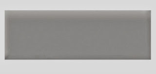
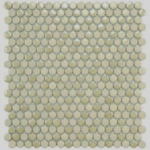
After searching through endless accent tile options and balancing style with budget, I found a fabulous mini brick marble mosaic at Home Depot. I used in as a border and in the inset. To add a little more dimension to the border, I sandwiched it with two bands of white beveled subway tiles.


Another element I used in the master bath to elevate it a little was marble sill found in the flooring department at Lowe's. I used it as baseboard, to cap the shower curb and to cap the narrow ledge I designed to run the length of one of the shower walls.


2.13.2014

room by room :: kitchen

I love to cook! I love to bake! And when we have a full house, I do a lot of both (plus all of the cleanup that follows). It was very important for me to have a very well thought out kitchen design that would function efficiently and of course, be beautiful. Ours is an open floor plan, so the elements of the kitchen had to flow with the adjacent dining and living rooms. The kitchen design actually dictated how much of the remaining floor plan played out. From the initial concept, I began taking notes and gathering inspiration photos of kitchens I loved. This is the first kitchen I pinned. I instantly fell in love with these huge to-the-ceiling, wall-to-wall windows.
Marsh Residence Rustic Kitchen :: Dungan Nequette Residential Design
I also liked the way these three narrower windows were framed and trimmed together. This option seemed like a more practical way to achieve a bank of windows since our kitchen is on the first floor.
This unique design has always been one of my favorite kitchens and probably sparked my preference for open shelving in lieu of upper cabinetry.
RiverCamps Idea House :: Southern Living
The other thing I was sure of was that I wanted a white kitchen. I love the fresh, crisp look and since we had decided to use tongue and groove pine on all of the great room walls, stained cabinets would have been way too much wood. I liked the simple design of this galley kitchen with open shelving flanking the window.
I also liked the way this kitchen blended crisp white with natural wood elements and the fact that it doesn't necessarily look like a "kitchen" straight on.
I started like I always do with sketches of several configurations. Each had one constant: the coveted bank of windows. Here's one of the designs where I considered twin banks of tall cabinetry. Can you tell I'm really attracted to symmetry?
Preliminary North Wall Design :: Lemongrass Interiors
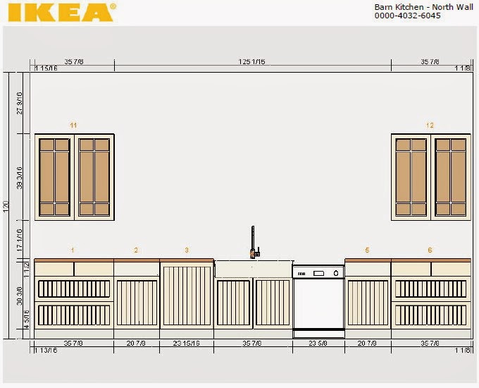
For several reasons, practical and aesthetic, we decided on cabinets from Ikea. Other than their excellent value, they are well-designed and have tons of smart components like soft closing hinges, full-extension drawers and interior organizers. Ikea has also nailed the whole "modern meets country" thing -- exactly the concept behind the barn house. After the layout was set, I used Ikea's handy kitchen design tool.
North Wall Design in Progress
In this design, I was still toying with the idea of cabinets to flank the windows which would completely fill the large blank space. For the refrigerator wall, I wanted to recess about half of the depth of it into the wall and flank it with cabinets with glass doors. 
West Wall Design in Progress
To get the right configuration, I decided on 12" deep wall cabinets for the uppers and lowers. Then we planned to build a custom surround, mounting the Ikea cabinets on either side -- hoping to achieve a seamless built-in look. In the end, we decided on the Adel Off-white fronts and lots and lots of drawers.
Akurum Base Cabinet with Adel Off-white Front :: Ikea
I also decided against any upper cabinetry on the back wall and instead chose six (three on each side) white Ekby Jarpen shelves with Bjarnum brackets.
Ekby Jarpen Shelf with Ekby Bjarnum Bracket $24.99 :: Ikea
I also fell in love with Ikea's Domsjo double bowl, apron front sink. Its huge, beautifully designed and an awesome price! Anyone who's shopped for an apron front sink has no doubt experienced sticker shock. But at $312.98 (!!!) the Domsjo is a no-brainer. 
Domsjo Double Bowl Sink $312.98 :: Ikea
We decided on several other items from Ikea including the Ringskar faucet with pullout function which was a steal at $159, as well as their side-by-side refrigerator and dishwasher both in stainless steel. And after considering alternate options like zinc and concrete (so over granite!) for the countertops, we chose white laminate. I love the look and practicality of it and at that particular stage in construction, it was the best choice. Honestly, we were exhausted and had a long punch-list. The idea of forming and welding zinc or pouring our own concrete countertops was just too much. We reasoned that if we tire of these or they don't hold up the way we hope, we've only spent like $300 so...

Just 10 days after moving in, we hosted Thanksgiving for 35 family members! I put the kitchen right to work and it functioned perfectly. I can't wait to share the finished design with you! 


1.21.2014

room by room :: little girl's bedroom

For this little girls' bedroom, which will also serve as a guest bedroom, my goal was to design a cheery space that was young, but not so juvenile that an adult would feel like they were trapped in a Disney cartoon. And although the color scheme would deviate somewhat from the rest of the house, I still wanted to maintain a blend of traditional, vintage & modern elements.
Breeze Blue Sky by P. Kaufmann :: Melinda's
I found this fun print at a small, but very well stocked fabric store called Melinda's in Brookhaven, MS. It's a modern take on an old-school paisley print and has a variety of colors to work with in fresh, current shades like lime, citrine & raspberry. And at only $24.99/yard, it wouldn't cripple my budget. I had already designed and made the bubble chandelier, which I thought was whimsical and modern at the same time.
DIY Bubble Chandelier :: Lemongrass Interiors
I also had my eye on several vintage-style beds, including a really awesome peacock rattan and this super fun Jenny Lind in the same raspberry color found in my fabric -- (I love it when a design starts coming together!).
Jenny Lind Bed in Raspberry $799/queen :: Land of Nod
Sure the color was perfect and the style was a classic...but the price was a deal breaker. So I  went on the hunt and found an antique bed with turned posts for $50 bucks!! It was originally a full, but since I need to make new rails and repaint the whole thing, I can convert it to a queen with no problems. I'll be sure to post the DIY on that soon. Despite a few sceptical, raised eyebrows,I've chosen Benjamin Moore Italiano Rose for the bed. Online it looks a little rosy, but the actual color is much punchier.
With the inspiration fabric and statement furniture piece set, I decided to go with a pale yellow on the walls. As anyone will tell you (even design veterans), yellow can be tricky! I pulled out my Ben Moore fan deck, tacked up larger samples and painted swatches on the wall diligently checking them at different times of the day. I finally settled on Lemon Sorbet...sounds fun right?
Holy Ray Bans! Though I tried to warm up to it...this color was nearly blinding. After a week, I repainted the room in a tried and true standby...Hawthorne Yellow. Safe, calm...
...and muddy. I didn't even give this one a week. Late one afternoon after I had walked in and out of this room maybe a dozen times, I dumped the remaining Lemon Sorbet in with the remaining Hawthorne Yellow and kept adding white until I reached what I felt was the perfect shade.
Now of course there's no formula for recreating this color, but I was able to take a sample to my paint guy and have a full gallon mixed that (thank goodness!!) was a perfect match. Here's a shot of the new, lovely, makes-me-happy-when-I-see-it color going over the Hawthorne:
yessss!
At this point, the design could use a little white, so I'm planning to repaint a vintage nightstand we already have and I'm on the hunt for a dresser. I'll also be looking for an ornate, carved vintage mirror that I may paint to match the bed. For the finishing touches, I have this Robert Abbey Double Gourd Lamp in Apple Green in my stash...
Apple Green Double Gourd Ceramic Lamp by Robert Abbey $190.91 :: Lamps Plus
...and I found a great source for affordable, original art at Scoutmob. This watercolor has a sweet old fashioned vibe that I love and is only $30.
Modern Floral Watercolor by Kiana Mosley $30 :: Scoutmob (sold out)
For the bedding, I plan to use a plain white duvet set from Target and have my friend "The Monogram Queen" at Persnickey in Port St Joe, FL add a large, classic monogram to the shams a la Leontine Linens. I'm kind of digging the blue color of this monogram, which is also found in the Kaufmann fabric.
I'll top it with a "bed scarf" sewn from the inspiration fabric and maybe one accent pillow. I am forever in love with all things Quadrille, but the China Seas prints are fabric perfection! I think the graphic nature of Aga reverse (as shown on this adorable stool) would be spot on.
Aga Reverse in Watermelon on Tint by China Seas :: To the Trade
Finally, I'm looking for something fun on the floor. Every room can use a little stripe and I'm a big fan of Dash & Albert rugs for their simplicity, functionality & value.
Tiki Stripe by Dash & Albert $225 6X9:: Joseph's Cottage
Tiki Stripe is one fun option and I like the wide, bold swaths of color. I also found this adorable (and cushy) DIY option on the british blog "Conversation Pieces". 
DIY Felt Rug :: Conversation Pieces
I'm not sure if I can get my hands on the same smaller rugs she found, but I'll have fun trying!

12.17.2013

room by room :: guest/kids bathroom

While I'm putting the finishing touches on the boys' bedroom, I thought I'd share the design plan for the downstairs guest bath that is primarily used by the kiddos. Keeping that in mind, I wanted the bathroom to be #1 functional and easy to clean, #2 simple and classic and #3 gender neutral. One of our first choices was this vanity and sink combo from Ikea.
Hemnes + Rattviken Sink Cabinet $379 :: Ikea
We spotted these vanities on a "idea gathering" trip early in construction and, individually, picked them out. Then when we were showing each other what we liked...we realized we'd chosen the same ones making these an easy choice. I was inspired by the color scheme and stripe design in this bathroom by Sarah Richardson (one of my favorite designers).
Classic Ensuite :: Sarah 101
In this design, she blended off-the-shelf tiles in white, cream and gray - a combo that I felt was neutral but not too boring and would give me flexibility with wall paint and accessories through the years. Now, to interpret that inspiration for our bath. First I chose the floor tile and grout color (which I also planned to use in the master bath).
American Olean 12-in x 12-in Sausalito White White Ceramic Mosaic Wall Tile (Actuals 12-in x 12-in)
American Olean 12X12 White on White Hexagonal Tile $2.57/sf:: Lowe's
Polyblend Sanded Grout in Delorean Gray :: Home Depot
The photo of this grout is quite a bit darker than the actual product when it's dry. I thought the gray was a nice contrast to all of the classic white tile. I had already I painted the walls a very pretty light gray. 
We installed a white tub, deciding on ceramic tile for the shower surround. For this, I wanted a rectangular field (main) tile, but large rectangle tiles are muy expensive! So I searched and searched, configured and reconfigured...I finally settled on this 6X8 tile from Home Depot. In the end, the size turned out just right and the price was awesome!
U.S. Ceramics 6X8 Tile in Bright Snow $2.25 ft :: Home Depot
But of course, I wouldn't be happy with a plain white shower stall. So I broke out my trusty graph paper and designed a stripe pattern that would add some style, but hopefully not be too busy for the space. I found a gray 2X6 trim tile and penny rounds in an almond color.
Daltile Semi Gloss 6X2 Bullnose Ceramice Tile in Ice Gray $0.98/each :: Home Depot

Merola Tile Cosmo Penny Round in Almond (12X12 sheets) $6.97/each :: Home Depot
I decided on two accent stripes that consisted of a 4" band of the almond penny rounds sandwiched between two bands of the gray bullnose. I ordered the accent tiles without getting samples first, but when they arrived, I couldn't have been happier. The gray is almost a perfect match to the wall color and the penny rounds have several shades of cream and almond that give it really nice dimension.

**A little side note of serendipity here: When I was shopping for the gray ceramic tile, I took a chance and ordered the bullnose tiles which were less than a dollar each as opposed to $2.05 for the 1/2X6" flat liner (too thin anyway) or $1.98 for the 2X6" field tile. That was a huge savings! As it turns out, the thickness of the ceramic field & accent tiles is slightly more than the thickness of the penny rounds. So when installed, the curve of the bullnose rounded perfectly to the penny rounds. I'd like to say I planned that all out, but I just got super lucky!

I'm framing the last art prints now and installing a few accents. I'll post shots of the completed room soon!

BTdubbs...Only a week till Christmas Eve!! Heading out now for some last minute shopping, which is honestly, my favorite kind. I love working on a tight deadline! LOL 

Merry Christmas Peeps!


12.11.2013

room by room :: boys' bedroom

Before we even broke ground, I started gathering ideas and created a design board for each room. Often, my inspiration is sparked by a fabric that I find (or have in my stash). For the boys' bedroom, I started with an awesome orange slubby linen that I had left over from a previous job, some art and accessories gathered over time and this very cool bed that I found on Pinterest.
The style of this bed was perfect for the "streamlined rustic" look I was trying to achieve. I knew it was a DIY project I could easily tackle and I loved the idea that each boy would have his own reading light.
I had about 3 yards of this slubby linen in a great orange color that I used as the jumping off point for the accent color used throughout the room.
After deciding on the accent color, I pulled the rest of the color scheme together with neutrals that were a variation of the basic khaki and black. I wanted the walls and bed color to have an olive tone and the black to be a softer iron color, kind of charcoal. I chose Benjamin Moore's Camouflage for the walls, Creekside Green for the beds and Raccoon Fur for the chest of drawers & nightstands. Then for painted items in the accent color, I used Orange Blossom.
Both boys love hunting and fishing so I ran with that. Some of the accents I planned to use were a vintage Winchester poster, a group of fish prints in simple frames, a couple of unfinished wooden boat oars that I found at a local marine supply store for $19 each and this "warehouse" style pendant from Home Depot that was a great bargain!

Hampton Bay 1-Light Warehouse Pendant $29.88 :: Home Depot
While I loved the style, the brushed nickel finish didn't quite jive with the rest of the room. So I broke out every DIYer's best friend...spray paint. A quick once-over with steel wool to rough up the surface and a couple of coats of Rust-Oleum's Soft Iron spray paint and it was perfect.
Furniture for the room consisted of the beds (I constructed two queens for this room), a nightstand that just needed a color change, a desk and two Tarva chests from Ikea for just $99 each! These have clean lines, are solid pine and are so versatile (there are tons of hacks all over the web). They were also the perfect size for the space and made it possible for each boy to have his own.
Tarva Chest with 5 Drawers $99 each :: Ikea
 As for bedding, I found these great blankets at Target from their Threshold line in a gray pickstick.
Queen Threshold Organic Blanket in Gray Pickstitch $38.99 each :: Target
I had also previously scored a clearance deal on two striped throws from West Elm. I think I bought them before we even had walls, but a deal is a deal... and they had the exact colors and feel that I wanted for the room. For the window treatments, I've sewn simple roman shades in white cotton duck fabric with the soft iron color as an accent. 

In my next post, I'll show you the completed room and how its all come together...

Follow my blog with Bloglovin

C7JF48J76TDK

12.05.2013

catching up + diy bubble chandelier

So its been about six weeks since my last post and in that time, we've finished the house and moved in. Just a week and a half later, we hosted Thanksgiving for nearly 40 people!  Now its time to hit rewind and catch up on all of the dilemmas, decisions and details that resulted in a home we truly love...

If you took a look at my Pinterest inspiration board, you may have seen this super adorable bubble chandelier by Pelle.
I thought it would be perfect for the third bedroom which serves as a little girl's room and doubles as a guest bedroom. Its whimsical and modern at the same time -- fun for a child without being too juvenile. I think the original was about $395 (completely reasonable knowing what it takes to produce a light fixture for resale), however that wasn't in the budget, so I did a little research. Turns out, CB2 sells glass balls in two sizes and they already have a little hole in them which is perfect for inserting the wire holders. Here's what I used:

  • five of the large glass balls ($3.95 each)
  • seven of the small glass balls ($1.95 each)
  • a white canopy kit from Home Depot ($7)
  • two packs of candelabra base keyless sockets ($4 each)
  • white lamp wire
  • two packs of 4" candle socket covers ($2 each)
  • one pack of four 40W candelabra base bulbs ($6)
  • cotton twine (I already had this)
  • paperclips
  • glue gun & glue sticks
I started by making the wire holders. The wire that I had was a little too light, so I used paperclips instead. The wire is stiff and also thin enough to get through the hole. You'll need to clip the paperclips with wire snips and use only the straight sections. Bend/twist the pieces to make a loop and then bend each end down so the ends of the wire won't scratch the glass.

Before inserting the wire in the hole, I tied the twine onto the clip. Slide the wire all the way into the hole and pull up so the holders catch.

My next step was to create four clusters of the glass balls and braid those together. As I created each cluster, I held them up and varied the lengths of the twine.

Now, I measured lengths of the white lamp wire. I made mine about 24" so that I could have plenty of slack to trim after I assembled the fixture. We have 10' ceilings, so I wanted the finished height of the chandelier to be about 18". Then I wired each socket. This is a fairly simple step (instructions are on the package and everywhere online), but if you're not sure, its a good idea to "phone a friend" here.

I added the wired sockets to each of the glass balls clusters, again varying the lengths. Then I wound the braided twine around and up the lamp cord, securing along the way with dots of hot glue. In the photo below, I have the bulb already screwed in. I need to add the extra step of the socket covers, which have to be trimmed and slipped on before the bulb is put in. I added another little detail (although in reality you can't see it after the chandelier is up) -- I wrapped about half of the socket cover in twine and continued it up the wire to meet the other twine braid.

I then gathered the four clusters together, adjusting the length along the way. The goal is to make it look effortlessly irregular -- kind of like creating the perfect messy up-do (that in reality takes 30 min and half a can of hairspray :))

Now the next step is where I needed some help (did I mention that thankfully my fiance is a master electrician??) . You'll need to wire the four lamp wires together and through the ceiling canopy kit. Again, there are instructions on the package and online. After it was all wired together, I needed to join the clusters together. I chose to braid lengths of twine together and then wind those up the lamp wires. You'll want to get this pretty tight, so I secured the four wires with floral wire, then wound the braided twine securing it along the way with dots of hot glue. I'll say, the braids on the original fixture are much neater than mine, but when its installed, you don't notice the irregularities quite so much.

This is my finished fixture and I'm thrilled with the results. It is also everyone's favorite -- even the men! The light sparkles through the clear glass balls and literally makes people smile the minute we flip the switch.